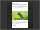
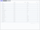
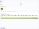
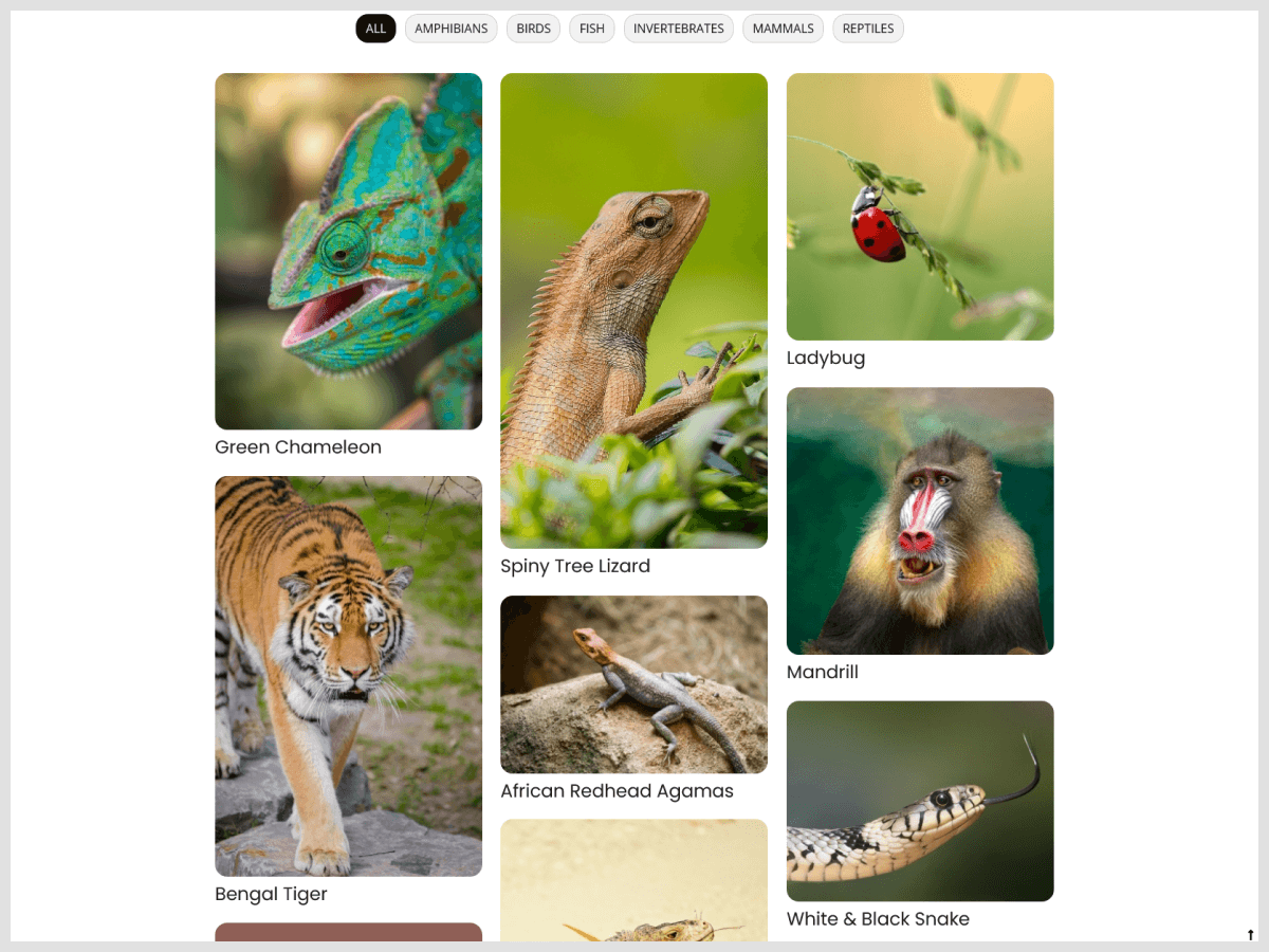
This plugin adds an AJAX-powered Masonry portfolio with category filters and a modal dialog.
Requirements
This plugin requires the Ajax Framework to be included in your layout/page. Place the {% framework %} tag anywhere inside your page or layout.
Features
- Pinterest-inspired masonry-based layout with ragged bottoms
- Complete control over column count, gutter and spacing
- Custom styling with Sass
- Loading effects
- Responsive images
- 2x image variants for high pixel-density displays
- AJAX-powered
- Category filters
- Modal dialog with details
- Custom scrollbar
- Optioanl horizontal left-to-right order
Contribution
The GitHub repository for this plugin can be found here. Please feel free to contribute or report any bugs.
You may like my other plugins/themes
- msof.droneworks - Single-page drone & UAV business services theme with a blog.
- msof.rapido - Polished single-page business-oriented theme with a blog.
About me
My name is Marios Sofokleous, and I am a web developer with industry experience building custom websites.
The following theme uses this plugin
PortfolioList Component
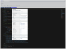
Use the PortfolioList component to display a filterable Masonry portfolio on a page. The component has the following properties:
- width - Width (1x only) of candidate image source (
srcattribute) for the user agent to use. - widths - Widths (1x only) of possible image sources (
srcsetattribute) for the user agent to use. - sizes - Value for the image element's
sizesattribute. - titleFontSize - Title font size
- titleTopMargin - Title top margin
- itemTopMargin - Item top margin
- itemWidthXs - Item width for extra small devices
- itemWidthSm - Item width for small devices
- itemWidthMd - Item width for medium devices
- itemWidthLg - Item width for large devices
- itemWidthXl - Item width for extra large devices
- gutterSizeXs - Horizontal space between items for extra small devices
- gutterSizeSm - Horizontal space between items for small devices
- gutterSizeMd - Horizontal space between items for medium devices
- gutterSizeLg - Horizontal space between items for large devices
- gutterSizeXl - Horizontal space between items for extra large devices
- modalPadding - Modal dialog padding
- spinnerColor - Growing spinner color
- horizontalOrder - Choose whether to lay out items to (mostly) maintain horizontal left-to-right order
Theming
Customize Portfolio by utilizing the source Sass file located at plugins/msof/portfolio/assets/sass/portfolio-list.scss
Responsive Breakpoints
The default grid breakpoints are defined in the source Sass file located at plugins/msof/portfolio/assets/sass/portfolio-list.scss and are the same as the ones used in Bootstrap 4.6.x:
$property-list-breakpoint-sm: 576px;
$property-list-breakpoint-md: 768px;
$property-list-breakpoint-lg: 992px;
$property-list-breakpoint-xl: 1200px;
If the default breakpoints are not suitable for your website, feel free to change them.
Since Portfolio is developed to be mobile first, it uses the following media queries:
// Extra small devices
// No media query for "xs" since this is the default in Portfolio

// Small devices
@media (min-width: $property-list-breakpoint-sm) { ... }

// Medium devices
@media (min-width: $property-list-breakpoint-md) { ... }

// Large devices
@media (min-width: $property-list-breakpoint-lg) { ... }

// Extra large devices
@media (min-width: $property-list-breakpoint-xl) { ... }
-
This plugin has not been reviewed yet.
-
| 2.0.0 |
Compatibility with October v3.1 Jan 26, 2023 |
|---|---|
| 1.0.1 |
Initialize plugin. Aug 04, 2021 |

